As a follow up to the Survey 32 dashboard I did, I was fascinated with the survey project as a whole conducted by Dr. Edward Gitre and his team, so I decided to take a crack at another survey from the website.
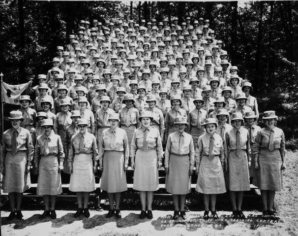
Survey 194 was titled “Attitudes of Enlisted WAC Personnel in Continental US.” There were 6,658 respondents from a variety of stations and commands. Respondents were asked about their background and how they were doing in the Army, amongst other topics. The survey was conducted in 1945.
I looked at a few questions and tried to see if I could tease out some things. I used Power BI to develop and a report after making a star schema from the data in Power Query.
Some things I noticed:
- Almost half of respondents said if given the chance to do it all over again, they would rejoin the WAC.
- In terms of ability to discuss personal problems with their commanding officers, respondents from Minter Field had 144 respondents. Of these respondents:
- 65.28% did not feel like they could talk to their commanding officer about personal problems.
- Minter Field accounted for 5.01% of all “NO” answers for this question, despite being only listed as the station for 2.16% of all respondents.
- 49.6% of respondents from Camp Atterbury responded that they had either “FAIRLY LOW” or “VERY LOW” morale. Camp Atterbury accounted for 3.24% of all “low morale” answers, despite only being listed as the station for 1.70% of respondents.
- 23.53% of answers from respondents serving at Muroc Army Air Field (Edwards Air Force Base now) indicated issues with adjusting to Army life. This accounted for 3.29% of all answers indicating poor adjustment, despite the fact that Muroc was listed as the station for 1.53% of all respondents.
It was an interesting survey to model and visualize to say the very least. I encourage anyone and everyone to take a look at the website and try to work with this data. A ton of work went into getting it into the state it is in now, which is actually pretty good to work with.
Below is the report I made. The chevrons change the charts on the bottom to show you different data points on the survey. They were about 100 or so questions and I focused on a few I thought were interesting.